

On the Daily

Welcome to the FXDD Research: On the Daily newsletter. This publication provides readers with a sliver of our research process to help contextualize daily economic and market developments across the globe. We designed FXDD’s research process to be intuitive and actionable; therefore, you can expect regular call-outs on risk-reward scenarios we think are lucrative. We typically follow global macro markets, particularly the US, UK, EU, Japan, China, alongside the aggregate World economy. We also follow global assets, i.e., stocks, currencies, commodities, and fixed income (though to a lesser extent). We quantitatively do all this; therefore, you can expect most of our analysis to be standardized, consistent, and repeatable. Finally, while we will offer some call-outs and trading signals, we reserve our most granular work for our clients, so if you like what you see, please head over to our website (click here)to gain access to the arsenal of tools we have built.
Before we dive into our updates, here’s a sneak peek into our quantitative portfolio allocation model. Our model allocated exceptionally well over the last month and has been up considerably due to its allocations to risk-on assets:
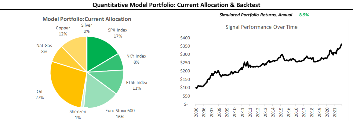
Our portfolio strategy was down modestly, somewhat mitigating yesterday’s down day, taking the one-month rolling performance to 3.9%. We continue to think the quantitative process is well-allocated to the current market trend, i.e., INFLATION. Here are the most recent developments in global macro:
Global Economic Momentum: We received some big data surprises in the US today, with ISM services PMI’s proving to be significantly stronger than expected. UK home prices data added to this bullish data mix, surprising to the upside. Overall, global economic momentum has had a strong week.
Global Policy: The big story on the policy front was the Federal Reserves’ announcement of a taper initiation, beginning in November. The Fed will reduce its asset purchases by $15 billion/month. As we stressed yesterdary, Chairman Powell proved adept, essentially able to initiate a “dovish tightening” based on market pricing. Globally, we aren’t in a tightening environment (yet) in an absolute sense, but we are incrementally getting tighter. As dollar liquidity tightens, we expect to see this increasingly impact currency markets versus the dollar.
Global Market Trends: As we mentioned above, Powell managed to thread the needle, essentially initiating a “dovish taper”. US stocks were up smartly, but global commodities were down in general. Looking at FX markets, the dollar was interestingly weaker thus far, adding further credence to the idea of a “dovish taper”. We think that the record highs registered in US equities are consistent with a market that expects profitability to be resilient despite slowing liquidity. Therefore, we continue to think risk can continue to rally, but as global liquidity gets tighter, we are likely to see profitable stock markets outperform.
Having addressed the significant changes over the last 24 hours, let us look at our monitors and models. For those of you wishing to get “to the point,” here are our top trend signals on the long side:

Now, for those looking for more detail, let us look at the underlying models. We start by tracking economic data relative to consensus expectations, as the impact of financial data on markets depends on whether its surprises the upside or downside. We standardize this data and call this indicator Economic Momentum, i.e., higher values are positive and lower values are negative. The color-coding in the table represents higher/more downward momentum for a given country:

Next, we show our estimates for growth through the lenses of our forecasts for global growth & CPI indices from the OECD. Notably, we highlight the fact that our models imply sustained levels of inflation in the near term, with moderating acceleration as we head in 2022:

Next, we show our Global Policy Monitor, which tracks the broadest measures of private-sector monetary aggregates (M4 money supply, credit impulse, etc.) along with our tracking of effective-central bank balance sheets (monetary base). The measures are normalized and standardized, with values above 50 implying rising monetary aggregates and below 50 reflecting slowing growth. The color-coding reflects increasing monetary base relative to its 5-year history for a given country:

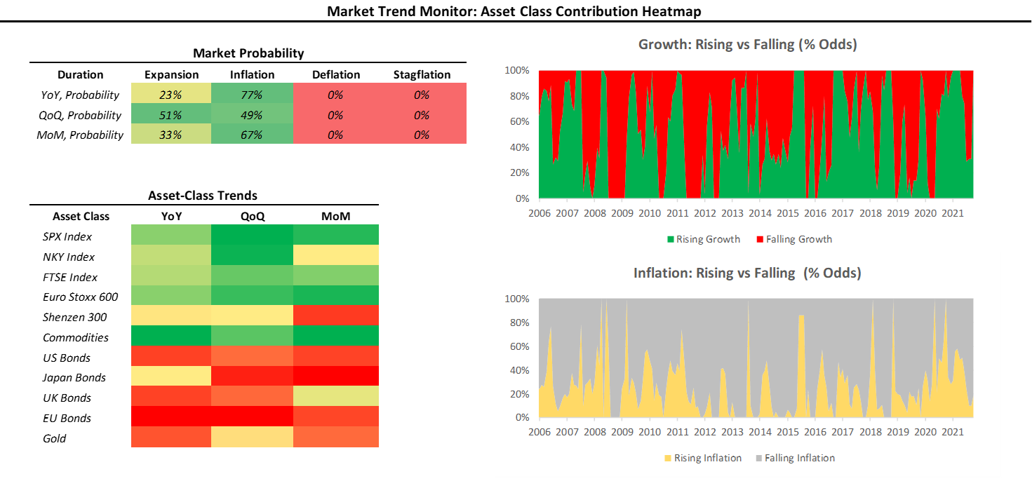
Next, we turn to how this combination of policy and economics reflects in markets. Below, we show our Market Trend Monitor, which tracks changes in global investment markets to classify market pricing as expansionary, inflationary, deflationary, or stagflationary. We typically prefer allocations in line with the current market trend. The current market trend is INFLATION, i.e., favoring commodities:
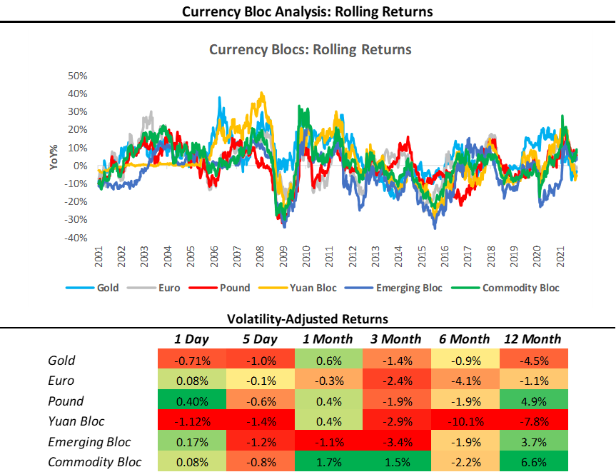
Next, we look at our Currency Bloc Monitor, which aggregates exchange rate moves across 20+ currency pairs into significant regions or Blocs. We use this method to estimate the flow of capital in the global economy. The color-coding in the table reflects the strength of a Currency Bloc versus others for a given time frame. We show the evolution of these Currency Blocs over time:
Finally, we show our Trading Tools Report, for the S&P 500, given the upcoming FOMC meeting. We display our various screens to assess risk and reward:
We look forward to sharing our extensive library of content with you over the months to come. If you enjoyed these materials, feel free to share this with friends or colleagues, and don’t forget to subscribe for more!